PURISTIC skin
May 2020
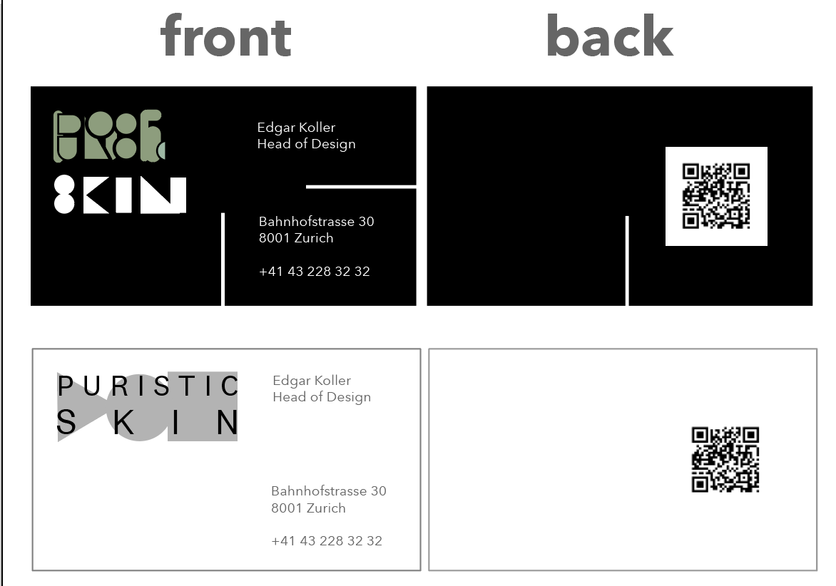
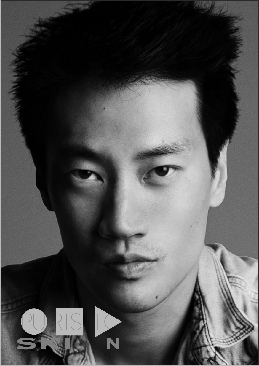
PURISTIC skin is a fictional skincare brand. The task was to create a brand identity. The coporate design of PURISTIC skin was developed from scratch within 4 weeks. Many touchpoints were created to give an idea of the “PURISTIC skin“ design language.


mobile website
New beauty brands are mostly discovered on social media. Thats why I choose to design a mobile version of the website at first, because most users are are online through their smartphones.
Instagram account @puristicskin

process
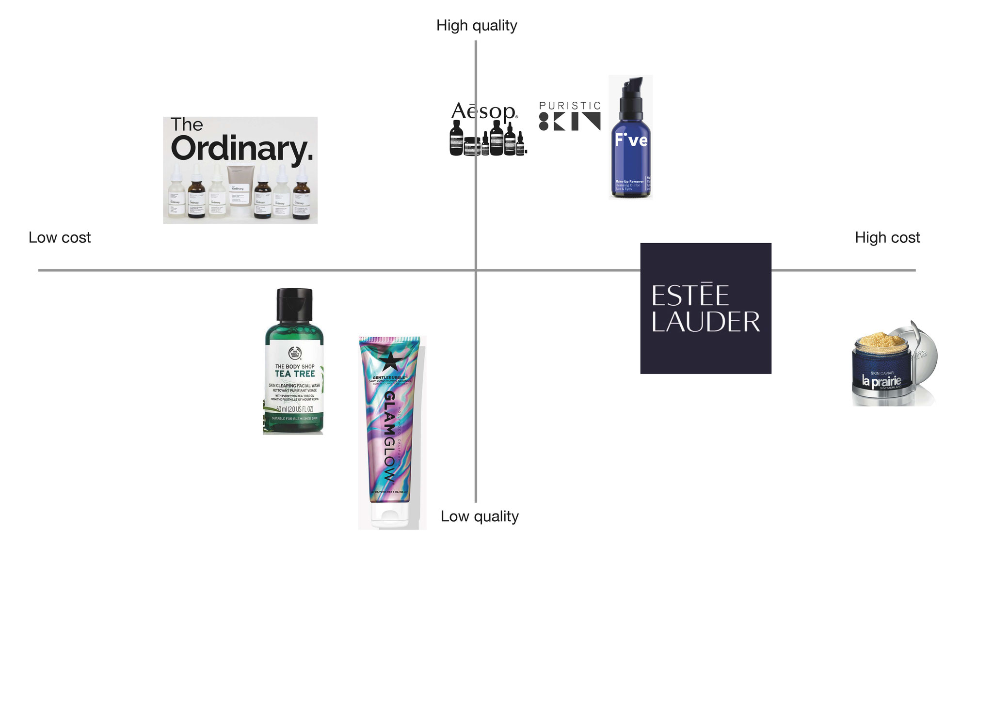
first step was the creation of the brand itself. the philosophy, the vision, the mission, the target group, etc. has to be defined first.
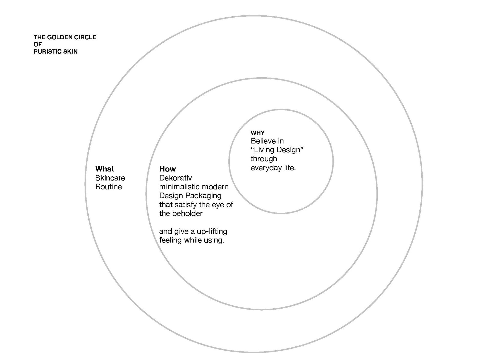


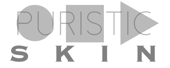
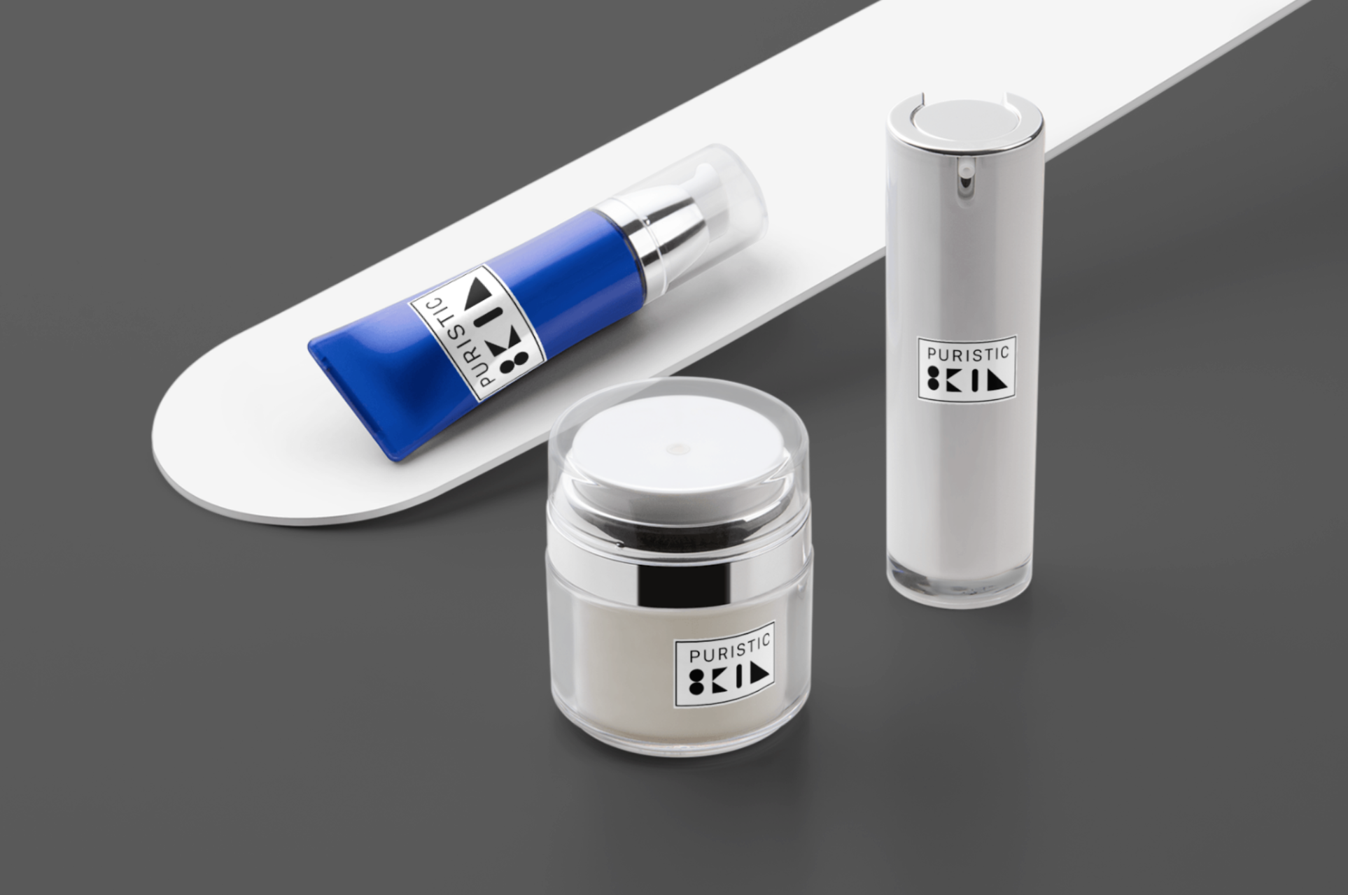
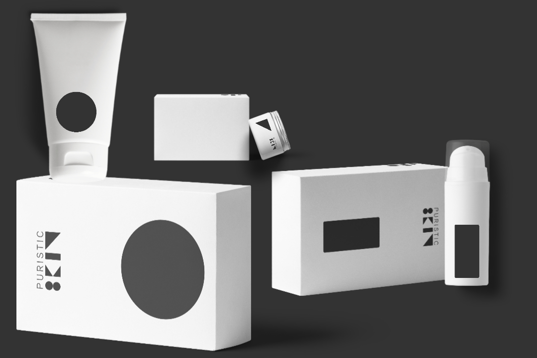
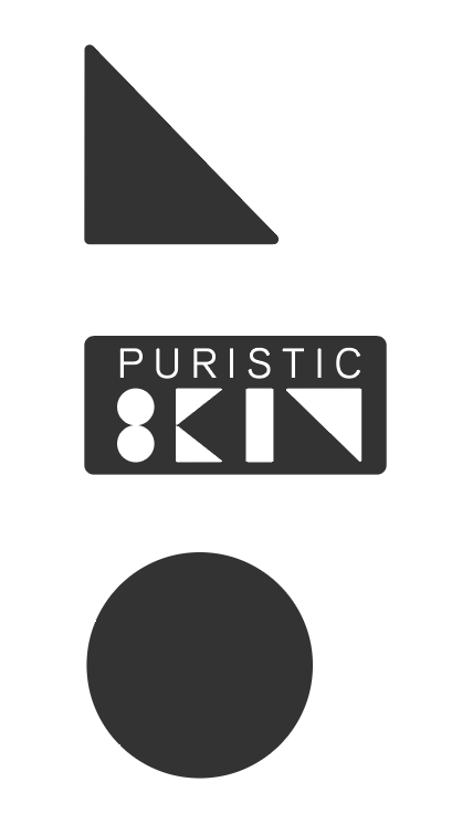
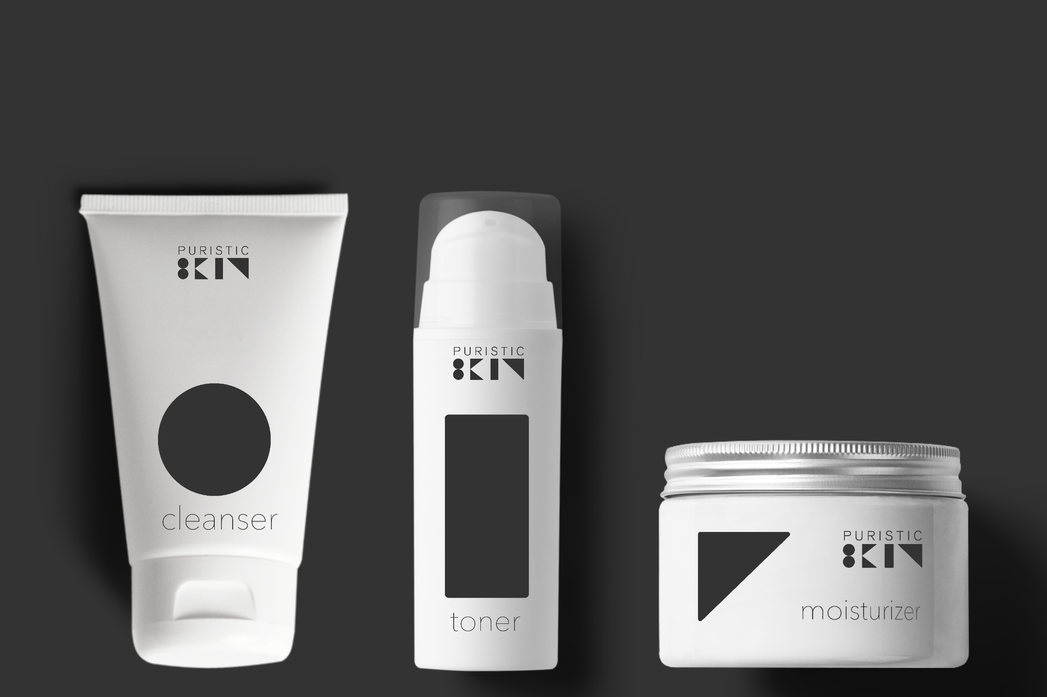
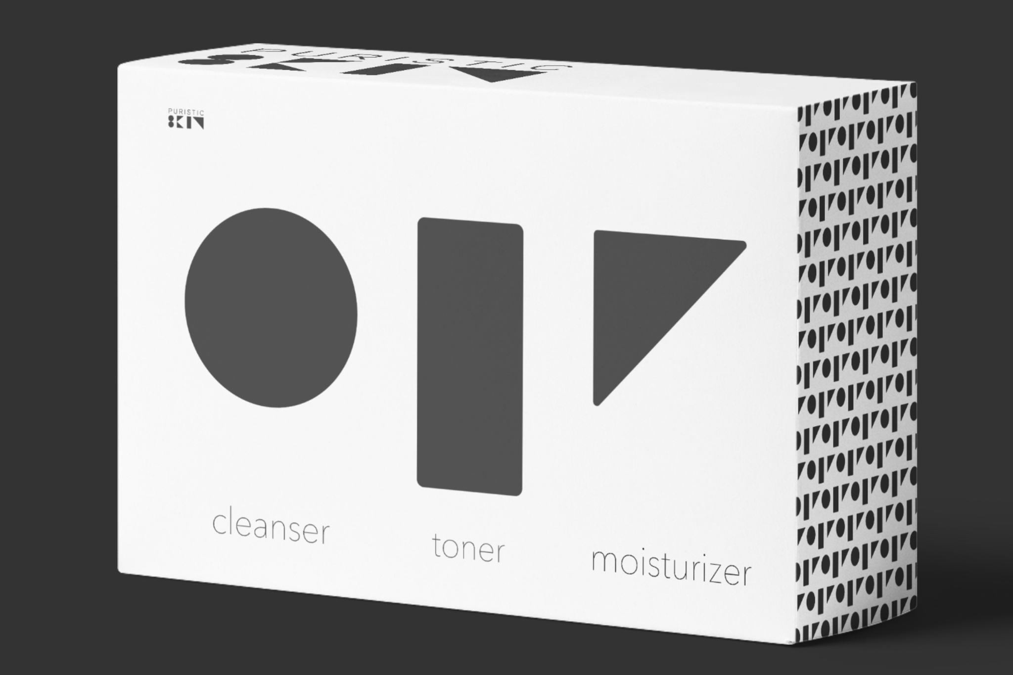
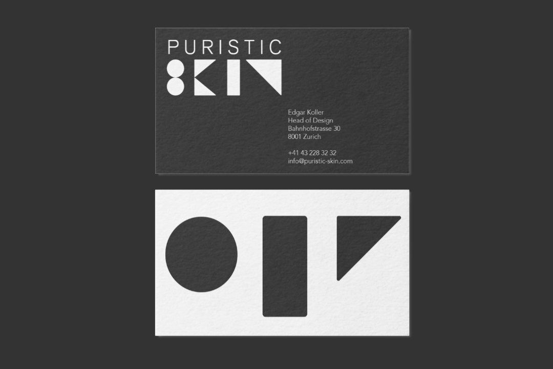
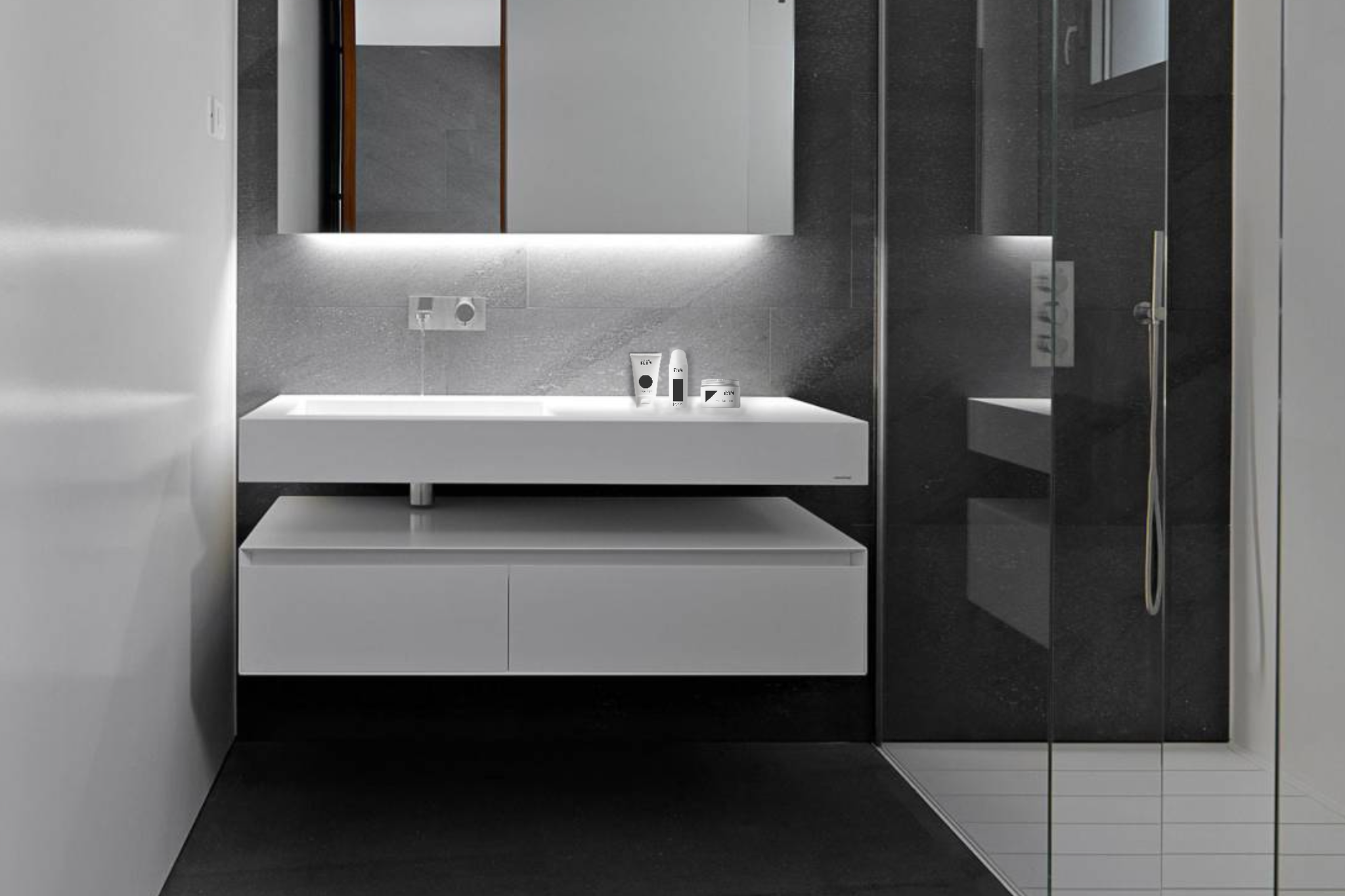
Then the developement of the logo. The product range contains 3 products:
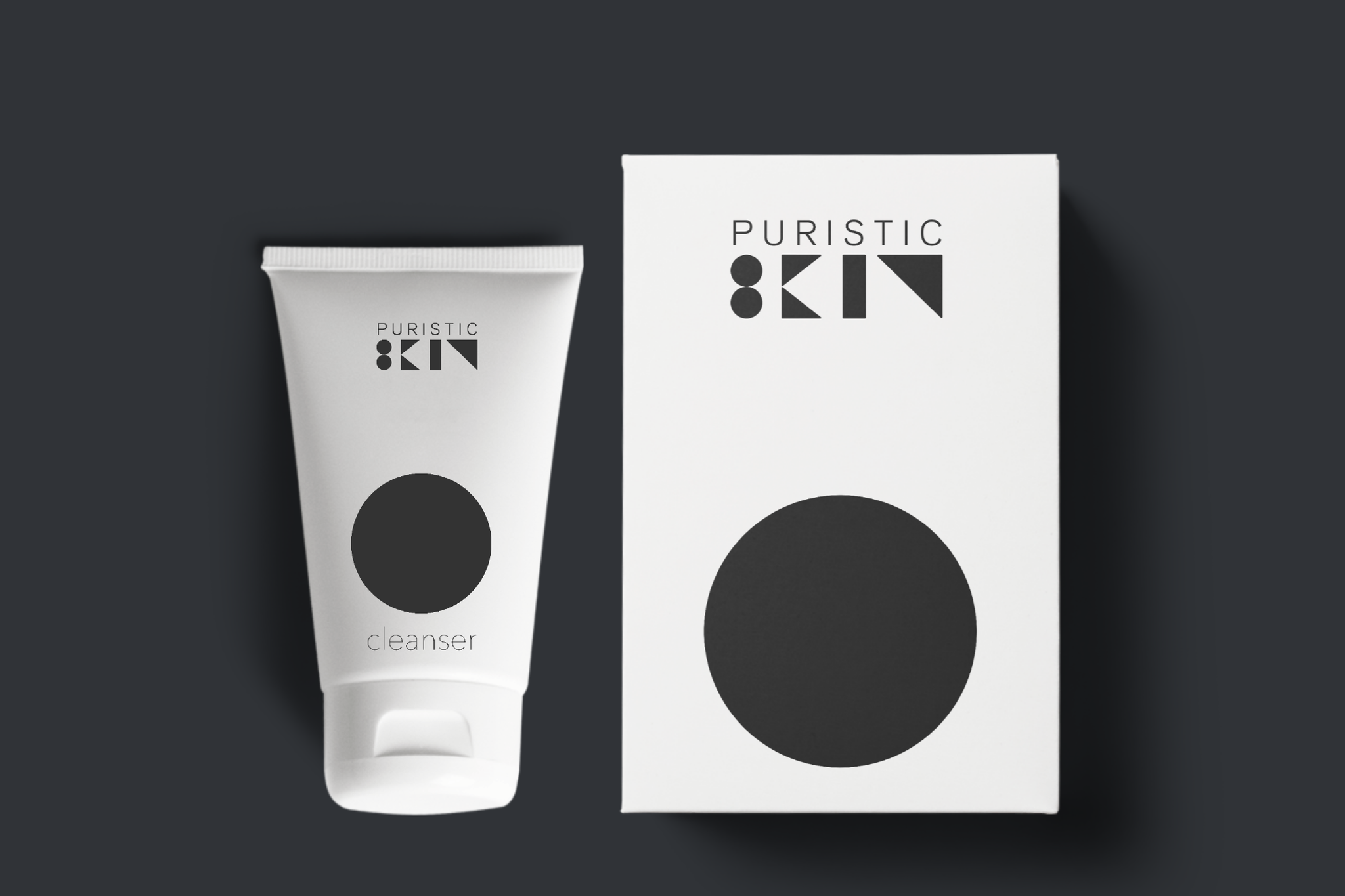
- cleanser (circle)
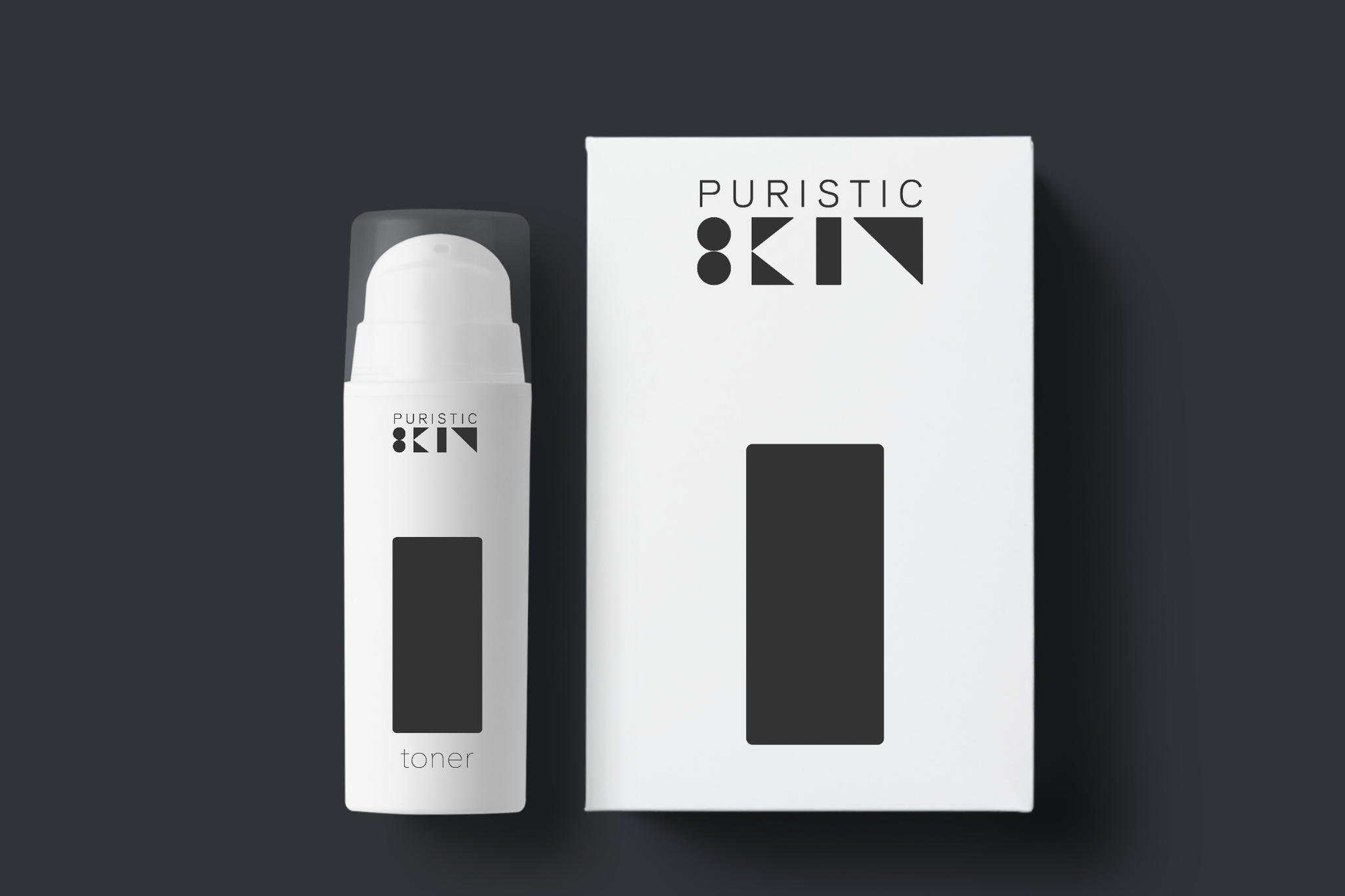
- toner (rectangle)
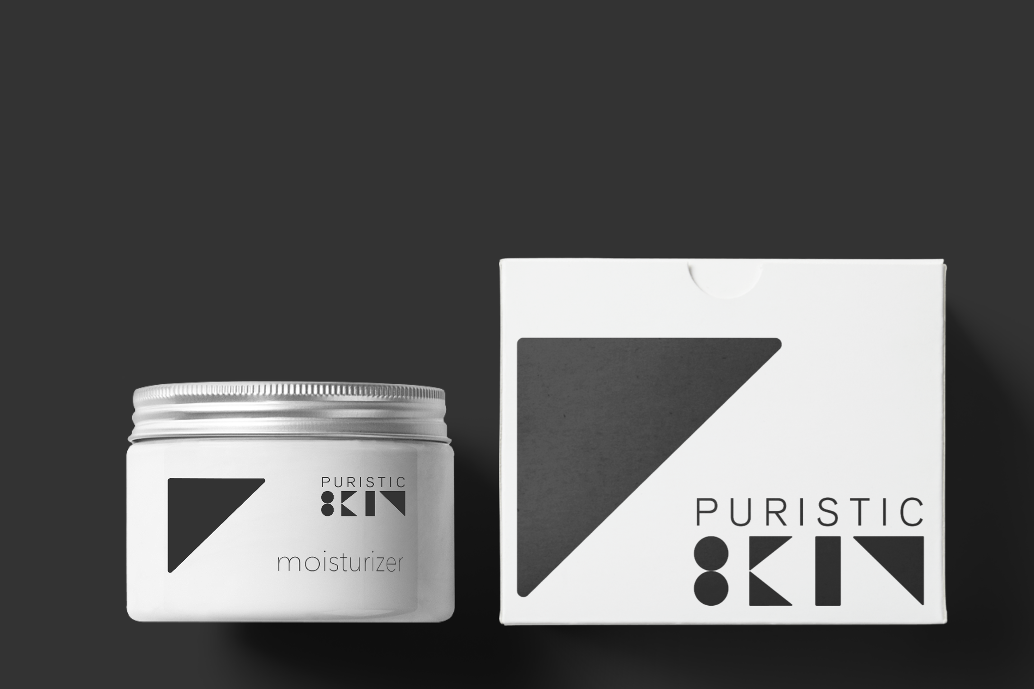
- moisturizer (triangle)
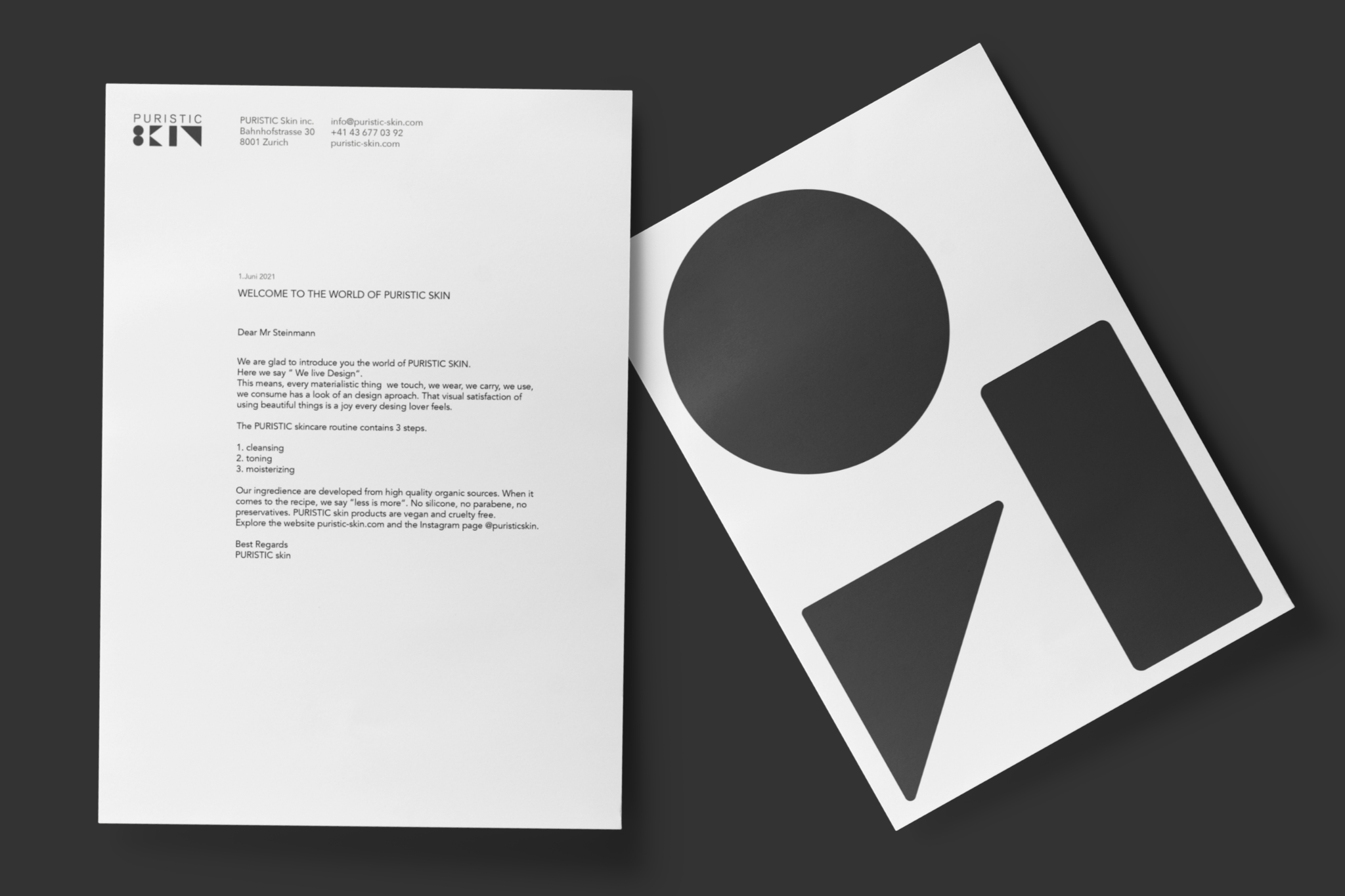
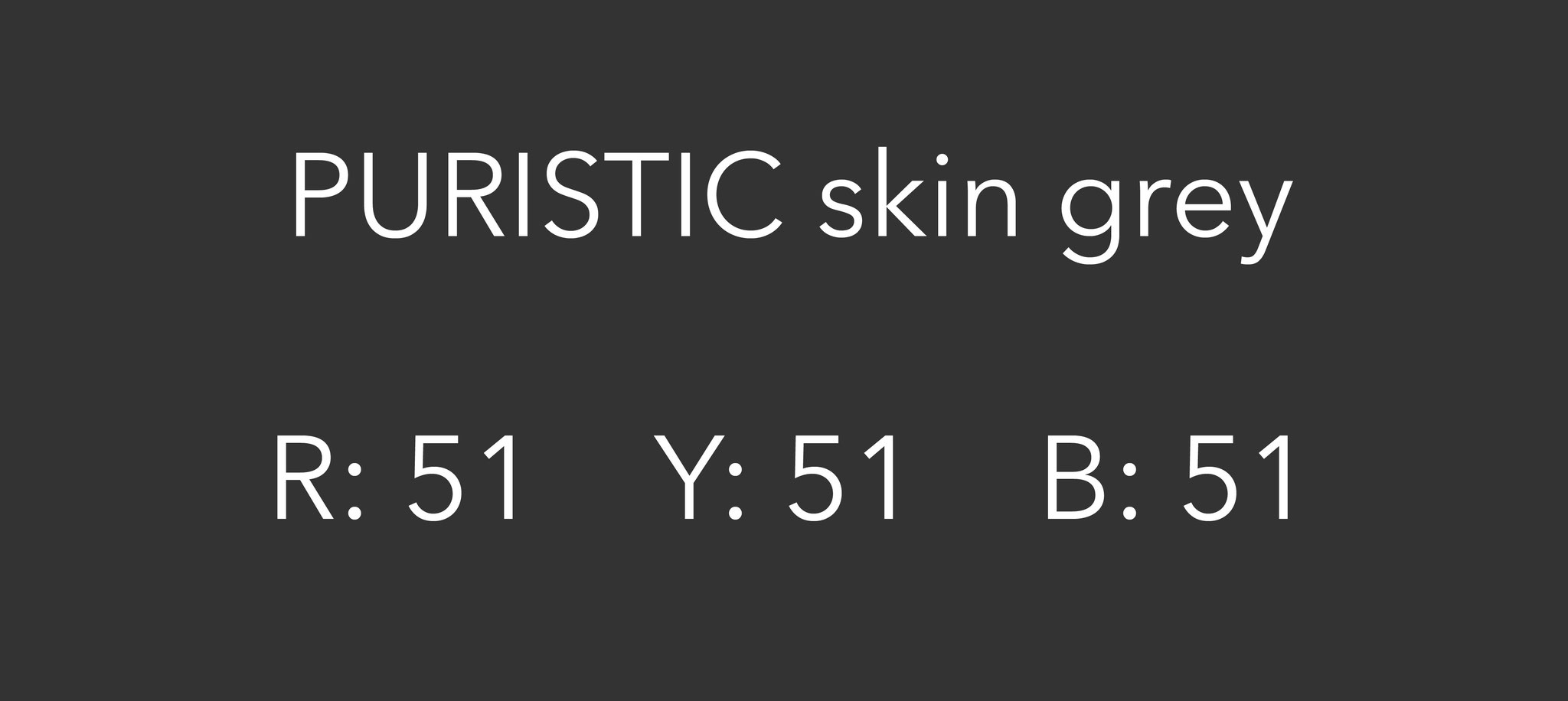
The word “skin“ includes all geometric shapes of these 3 products together. I chose dark grey as the color of the logo, because it represents this understatement. It's not simply total black, but slightly lighter. Thats where the sophistication shows up.


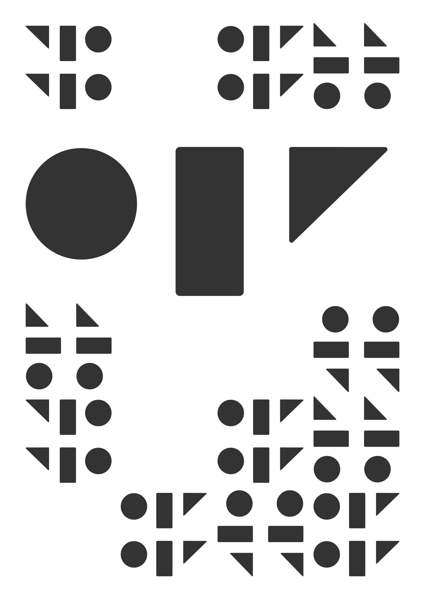
drafts in chronological order.